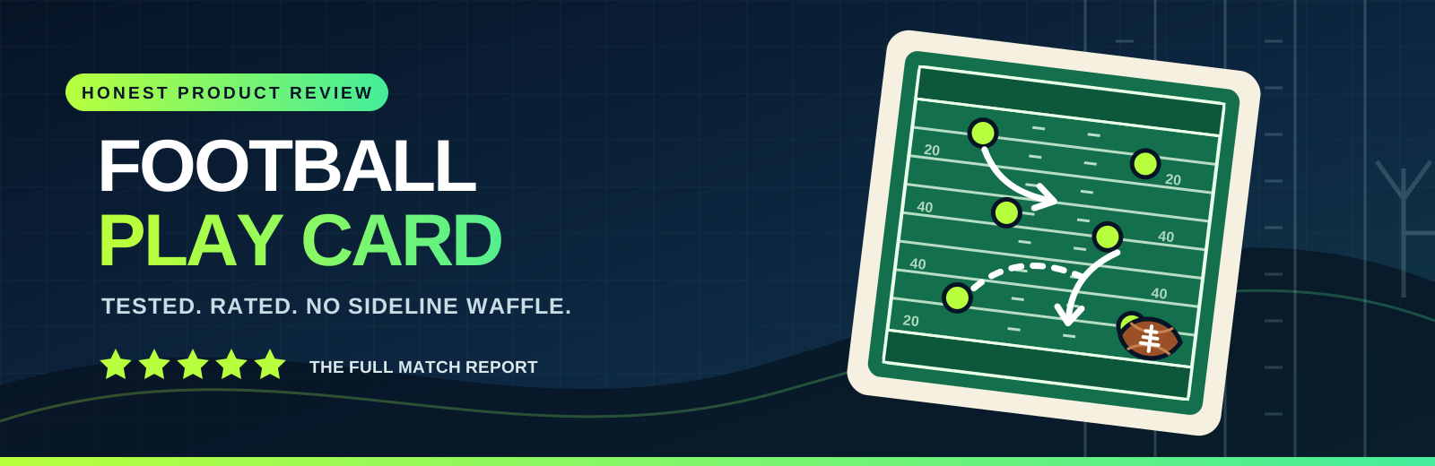
Why Large Print Football Play Cards Are Essential for Coaches with Visual Challenges
Coaching football is decision-making under pressure.

Coaching football is decision-making under pressure. You read formations, cue adjustments, and keep the communication loop tight, all while the ball is moving. For coaches with visual challenges, that job can get harder in ways that have nothing to do with knowledge or effort. It can come down to the size of the text, the spacing of diagrams, and whether the play call is readable when you are standing, moving, and scanning at game speed.
Large-print football play cards sound like a small accommodation, but on the field they often determine how consistently your tactics get communicated. When your eyes can reliably catch the information you need, the team gets clearer signals. Clarity turns into better execution, and better execution keeps your offensive tempo and defensive discipline from slipping.
Play Calling Accuracy Starts with Football Card Visibility
In football tactics, the difference between a clean rep and a messy one can be a half-second and a missing detail. A play card is supposed to be a fast reference, not a puzzle. When the font is too small or the contrast is weak, you spend mental energy translating what you see instead of coaching what needs to happen.
I have seen this firsthand in the sideline flow. A coach might know the concept perfectly, but during a quick series they rely on a tiny diagram or condensed wording to remember the handoff reads, motion timing, or leverage cues. If the card is hard to read, the coach hesitates, checks again, or uses a simplified version of the play call. That's where tactical execution loses precision.
Large-print football play cards help because they reduce friction across the entire workflow:
- Faster comprehension, especially during rapid substitutions.
- Less dependence on memory when the stadium lighting or distance makes reading harder.
- More consistent confirmation before the snap.
- Better confidence, which affects how boldly you adjust tactics.
If you coach in a busy environment, the payoff gets even more obvious. Stadium lights reflect off laminated surfaces, bleachers introduce glare, and weather changes contrast. A bigger, high-contrast layout gives your eyes a fighting chance across those conditions.
What “Large Print” Should Actually Mean on the Sideline
“Bigger” is not enough if the layout still forces you to hunt. For accessible football coaching, large-print football play cards should be designed for scanning, not studying. In practice, that means:
- Large text for the play name, personnel, and tempo notes.
- Clear separation between components like assignment, route stems, and key reads.
- Enough whitespace that the diagram does not blur into the background.
- High contrast between text and the card surface, so readability survives glare.
Your tactics are complex. The card should organize that complexity, not compress it.
Making Tactics Readable Without Losing Tactical Detail
Coaches worry that simplifying for visibility will dilute play design. There is a trade-off, but it does not have to be a loss. The best large-format play cards keep the key tactical decisions upfront and move supporting detail into structured sections.
Think of a play card as a small coach's checklist, tuned for speed. If your team runs route concepts, blocking assignments, defensive coverage rules, or motion timing, the card should show those components in a predictable order. Predictability matters when your eyes need a reliable path.
For coaches who support football cards for visually impaired staff or assistants, the goal is the same: tactical fidelity with easier access.
A Practical Way to Structure a Play Card
When I help a staff refine play cards for easier reading, I focus on hierarchy. The information should appear in the order you need it, not the order it was originally drafted.
Here is a format I have used with success for football play card visibility and clean sideline execution:
- Top band: Formation, play name, and down-and-distance suggestions (if your staff uses them).
- Middle: Primary concept diagram or defensive alignment sketch.
- Main box: Assignments or reads in short, direct lines.
- Timing strip: Motion, cadence, protection rules, or audibles that must happen in sequence.
- Bottom notes: Tags and quick adjustments, like “hot route if flat is down” or “switch to man if coverage rotates.”
With this structure, the large print supports the tactical intent. The play remains detailed, but the card becomes navigable.
Better Scanning Supports Communication During Substitutions and Adjustments
Football is rarely a static set of plays. You call, adjust, and communicate based on what you see. Sideline communication is a choreography of cues, and reading accuracy affects it.
During substitutions, coaches and assistants often have less time to look closely. A card that is readable at a glance prevents delays in relaying adjustments. That matters when you are matching fronts, correcting protection calls, or changing coverage checks.
Large-print cards also help when multiple people share the task. Some staffs use the same card between positions, while others have separate cards. Either way, better readability reduces the chance of someone misreading a tag or missing a coverage rule because the card is blurry at the moment it matters.
Edge Cases That Large Print Can Solve
There are a few sideline realities that are easy to overlook until you have to work around them:
- Distance, especially when you are across the field or up near the bench rail.
- Glare from stadium lighting that makes laminated cards wash out.
- Motion, because you are walking while scanning, not sitting at a desk.
- Fatigue, when the end of a half makes small text feel disproportionately harder.
Accessible football coaching is not just about one condition. It's about reducing the number of moments where vision becomes the limiting factor in tactical delivery.
Integrating Large-print Cards Into Play Design Tools Workflows
Large-print cards do not exist in isolation. They are part of your play design tools, the system your staff uses to build, revise, and share tactics. If you already have a workflow, you can layer in accessibility without turning the whole process upside down.
The most important step is consistency. If different staff members use different card styles, the coach who relies on large print has to re-learn layout every time. A consistent card template protects performance.
From a play design tools perspective, think in terms of “tactical components” you can standardize:
- Common diagram styles for formations and defensive shells.
- Repeated vocabulary for assignments and reads.
- Uniform spacing so you always know where to look.
- A predictable location for tags and adjustment rules.
When your cards become predictable, the coach's eyes do not have to search. They land.
A Clear Example: Route Concepts and Read Progression
Route trees are a perfect test for visibility. A small diagram with cramped labels can be impossible to interpret quickly, especially when you need to coach the timing of a read. Large-print football play cards can solve this by enlarging the critical labels, while keeping the overall structure tidy.
For example, if the play depends on a progression, the card can highlight the order using large callouts like “1,” “2,” “3,” and keep the route stems legible. You still communicate the concept, but you do not force the coach to squint through the progression at game speed.
That is where the tactical advantage shows up. The better the coach reads and confirms, the better the team runs the concept.
Supporting a Full Staff, Not Only the Head Coach
When people hear “large print,” they sometimes imagine it as a single accommodation for one person. In practice, it benefits an entire tactical ecosystem. Assistants, position coaches, and sideline coordinators often juggle multiple responsibilities. If their view is limited, they may miss details that the offense or defense needs.
Large-print football play cards also help during shared review sessions. If a staff member has low vision, they should be able to participate fully in teaching moments, not just execution. That shifts accessibility from a last-minute fix to a standard part of play design.
Accessible football coaching is about removing unnecessary barriers. When cards are easy to read, the tactical ideas stop getting diluted by formatting. The play design stays sharp, the communication stays clear, and the team benefits from coaching that does not have to fight its tools.
Ultimately, large print is not a courtesy. It is a requirement for consistent tactical execution when vision challenges exist. In football tactics, consistency is the quiet advantage that keeps your system working play after play, even when the game is loud and the sideline is busy.